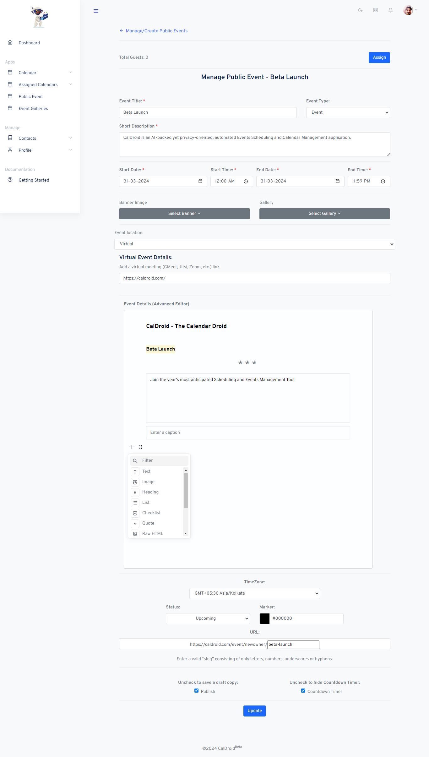
CalDroid - The Calendar Droid
Beta Launch
Join the year's most anticipated Scheduling and Events Management Tool
- Calendar Droid
ADD YOUR CUSTOM HTML/CSS
1. Main Content
The Ultimate Guide to Flexbox
The Flex Layout module is new layout module in CSS3 made to improve the items align, directions and order in the container even when they are with dynamic or even unknown size. The prime characteristic of the flex container is the ability to modify the width or height of its children to fill the available space in the best possible way on different screen sizes.
Flexbox is relatively new, but it enjoys excellent browser support today (nearly 83% of browsers support Flexbox). Flexbox Layout is used for small application components, whereas CSS Grid Layout Module is aimed to handle the large scale layouts.
The Two axes of Flexbox
When working with flexbox you need to think in terms of two axes ? the main axis and the cross axis. The main axis is defined by the flex-direction property, and the cross axis runs perpendicular to it. Everything we do with flexbox refers back to these axes, so it is worth understanding how they work from the outset.
3. Additional Stuff
In this guide you will learn:
- How to use CSS Flexbox to build modern layouts
- How to align items both vertically and horizontally
- How to order items within container
- And more
| Event | Organizer |
| Tomorrow's Event (16.06.2024) | Aritra |
| Day After Tomorrow (17.04) | Isaac |

